Shoulda Woulda Coulda

Previous Topic Next Topic
 
classic Classic list List threaded Threaded
16 messages Options
Reply | Threaded
Open this post in threaded view
|

Shoulda Woulda Coulda

Chowgi1203
Hello all,

I was hoping to get some advice/opinions/suggestions on lettering my C&S motive power. My ideas my be blasphemy to some, but it is C&S and it is modeling, so I am hoping that it flies on this board!

I am modeling the C&S narrow gauge as if it continued running into the 1960s. My issue is with my engines. I cannot decide if it would be more pseudo-historical to have "Colorado & Southern" on the tender or the Burlington logo, as the 641 and 638 had, with "C&S" on the cab side.

Any thoughts would help! Thank you and I apologize if this post isn't kocher for the board.

~ Chowgi

CutPaste_2019-05-10_21-54-05-583~2.png
Reply | Threaded
Open this post in threaded view
|

Re: Shoulda Woulda Coulda

Jeff Young
That's certainly the pattern I would follow.  While the Climax line had been standard-gauged, it was still distinct enough from the rest of the C&S system that I think it makes a better prototype of what NG operations would have look liked if they had still been around.
Reply | Threaded
Open this post in threaded view
|

Re: Shoulda Woulda Coulda

Rich Townsend
As I understand it, the Burlington tried to distance itself from the narrow gauge. So if one imagines that attitude persisted into the 1960's it would seem appropriate to have Colorado & Southern on the tenders. If one imagines that the Burlington finally embraced the narrow gauge, then the Q logo would seem to be the way to go.
Reply | Threaded
Open this post in threaded view
|

Re: Shoulda Woulda Coulda

Todd Hackett
In reply to this post by Chowgi1203
My preference would be for the Colorado & Southern lettering, but the Burlington did start to apply their logo by then, so that would be more likely if it had survived into the '60s.

They lettered #9 that way for the World's Fair in 1939, as shown in this photo dated March 12, 1939:


And as I understand, C&S personnel were responsible for painting #60 that way when it was on display in Idaho Springs, as shown in this photo dated July 21, 1950:


No. 60 was still had the Burlington herald in July 1981 before we put it back to C&S livery:


I don't remember whether #71 got this treatment as well. When we re-painted #74 in the 1980s. I remember that there were areas similar in size and shape on #74's tender to where the Burlington herald sticker was on #60 where the paint texture was different, similar to what we found on #60 after peeling the sticker off, so it's possible they experimented with it on #74 while it was in service, but I haven't seen any photos to confirm.
Reply | Threaded
Open this post in threaded view
|

Burlington Logos and Whitewall Tires

Keith Hayes
Todd, pictures are worth a thousand words as they say. (and FYI, I always enjoy your posts!)

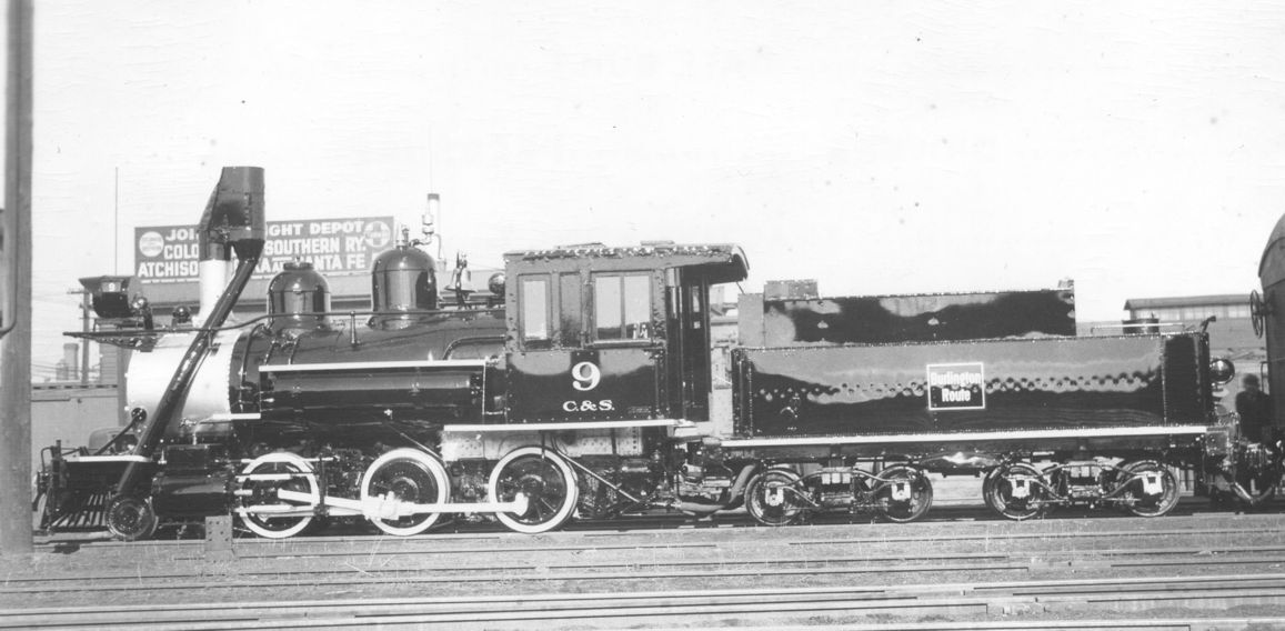
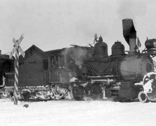
I speculate that the CB&Q perceived the narrow gauge lines as a historic anachronism that could not disappear quickly enough. They did not want to muddy the carefully pruned futuristic image of "The Line of the Zephyrs" with 1880s narrow gauge steam trains. It was okay though to go down memory lane with a ride behind a cute little tea kettle at the World's Fair, and in that case the Q wanted some brand recognition from the short excursion ride they created with narrow gauge equipment, hence the Burlington logo on B-3-C number 9.

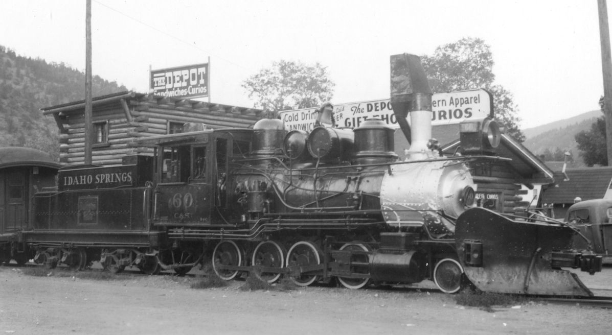
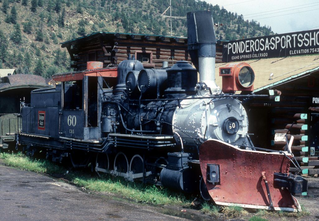
Once the locomotives were stuffed and mounted, there is no shame in painting the Burlington logo on the tender. After all, this is now the past, not the present and reminding your potential shippers of where you used to run must have had more corporate value, even if the rails were 40-50 miles away from Idaho Springs and Central.

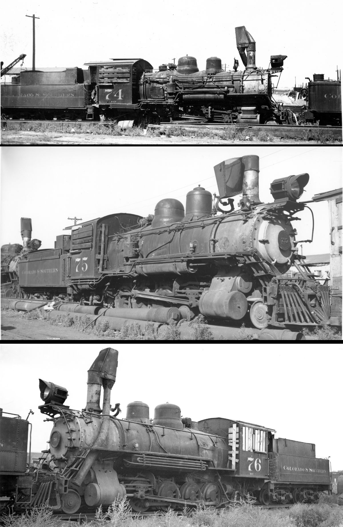
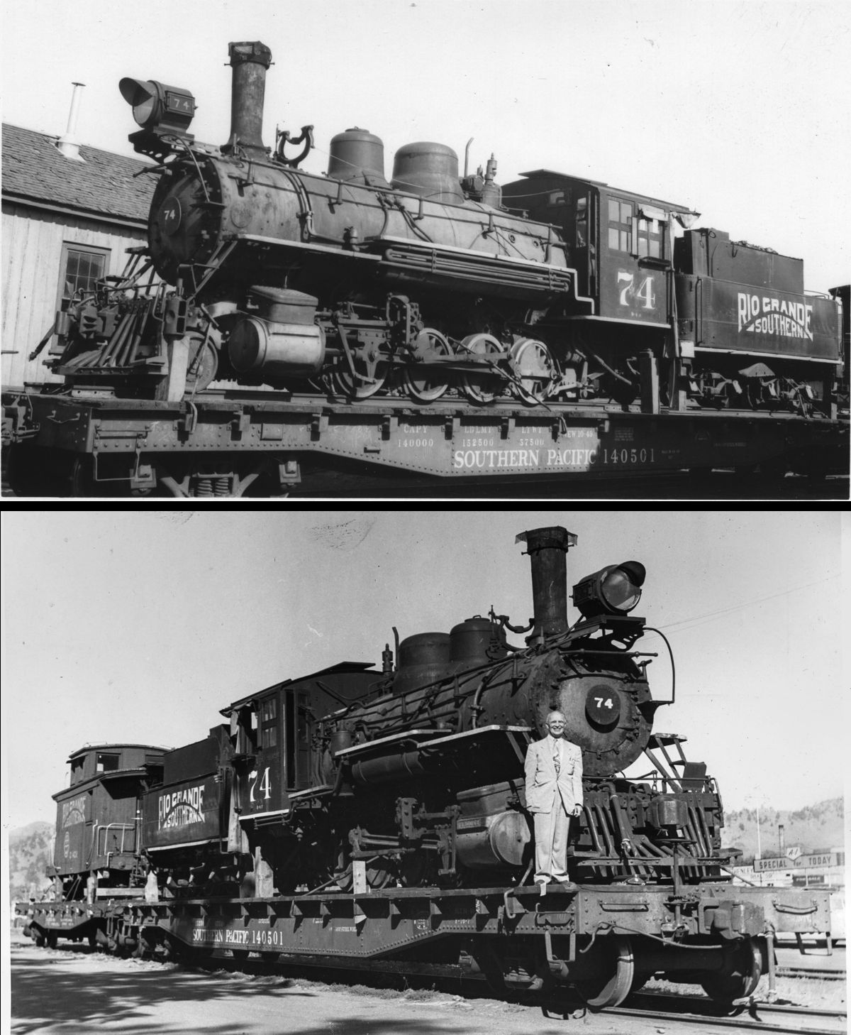
I myself have not seen any images of the three B-4-Fs in Leadville-Climax service with the Burlington logo. This is not to say it was not possibly applied, but I think it more likely something that occured once the locomotive was placed in the park in Boulder. The definitive point would be a photo of 74 on the flatcar being shipped to Denver or on display at Morse Brothers. But...Todd is the one that saw it with his own eyes, so please share more Todd!

I do have a couple questions!

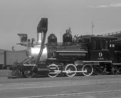
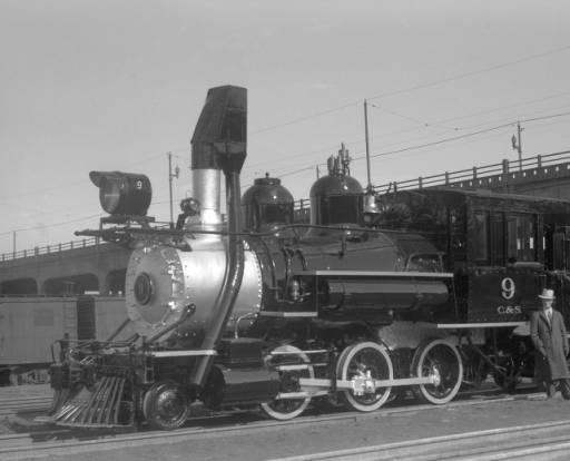
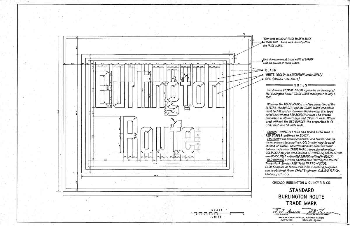
1. Since we are talking about the "Burlington Route" logo, can a true Chinese Red-bleeding Q fan please contribute what we call this logo? Is it the "square trademark?" Also, on 537, the logo was painted in a single color as an outline in silver/ gold/ white? When was the switch made to the logo with the red picture frame? What was the size of the logo and lettering? The logo on 537 seems larger than on 9 shown above.

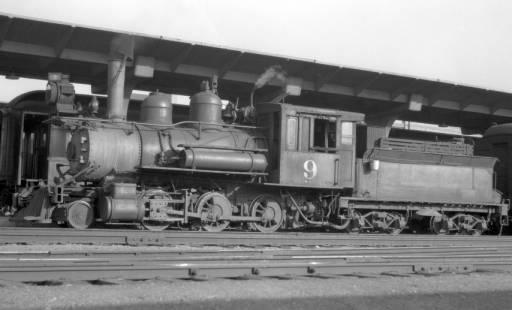
2. Is it just me, or do number 9s drivers seem smaller in the late 30s than in previous photos? When I see photos from the early 30s, 9 has a fat boiler and drivers that seem to fill the space from the rails to the underside of the boiler, and they seem to have less space between, too. Starting with the photo of 9 painted in Burlington livery for the Fair, the drivers get white tires and seem much smaller and not at all close together? Did the tires get turned down? A lot? I have never seen white wall tires make such a difference on a locomotive: discuss.
Keith Hayes
Leadville in Sn3
Reply | Threaded
Open this post in threaded view
|

Re: Shoulda Woulda Coulda

Chowgi1203
In reply to this post by Chowgi1203
Thank you for the thought provoking responses! I looked up photos of the B-4Fs at Morse Bros only to find that their tenders were blank. The only clues that I see are that the number is still on the cab with no "C&S" sublettering, and the lack of a rectangle, or even the traces of one, on the tender.

photo11.jpg

photo10.jpg

The jury is still out on what will come of my lettering system. It is fair to note that, as you said, they did re-letter 9 and 60 for the Q, and 537 as well. It is my understanding that since the C&S leased the 537 from the Q, the logo was kept on the tender for that very reason.

In response to how the Q treated the narrow gauge, in my timeline they deemed it justifiable to put money into the line, bulking up the rail weight, buying new locomotives and rolling stock, etc.

Perhaps a happy medium would be to put the 'picture frame' on new/newly acquired locomotives, using the real-life standard gauging of the Climax Branch as my cut-off point for the lettering that we all know graced the little line.

But I digress. Thank you again, your input is much appreciated.
Reply | Threaded
Open this post in threaded view
|

Re: Burlington Logos and Whitewall Tires

Alex Hois
In reply to this post by Keith Hayes
Keith,
You might just get tricked by the lighting, shininess of the paint, engineers (lots of pipes) vs. fireman's side (air tank, different running board configurations) and angle of the photo:

1918:
http://digital.denverlibrary.org/cdm/singleitem/collection/p15330coll22/id/42179/rec/1


1934:
http://digital.denverlibrary.org/cdm/singleitem/collection/p15330coll22/id/42195/rec/8


1939:
http://digital.denverlibrary.org/cdm/singleitem/collection/p15330coll22/id/42190/rec/6


1939 "short wheelbase":
http://digital.denverlibrary.org/cdm/singleitem/collection/p15330coll22/id/42192/rec/7


The top of the first drive looks like its at the same height in relation to the cylinder valve box.

Alex


Reply | Threaded
Open this post in threaded view
|

Re: Burlington Logos and Whitewall Tires

Chris Walker
In reply to this post by Keith Hayes
Keith,
examine any Model Diesel that has the old style model handrails such as Athearn and notice if the modeller has painted the vertical sections White or Black.  By the very nature of the Colour wave through atmosphere effect, Black will look thinner than White which looks fatter.  If you don't believe me ask any woman about that little Black number vs wearing White.  Red on the other hand will appear closer and Green will appear further away.  That's why the painted tyres make the wheels look different.
UpSideDownC
in New Zealand
Reply | Threaded
Open this post in threaded view
|

Re: Burlington Logos and Whitewall Tires

Todd Hackett
In reply to this post by Keith Hayes
Keith Hayes wrote
...but I think it more likely something that occured once the locomotive was placed in the park in Boulder. The definitive point would be a photo of 74 on the flatcar being shipped to Denver or on display at Morse Brothers....
They were lettered Colorado & Southern at Morse Brothers post-C&S, and 74 was lettered "RIO GRANDE SOUTHERN" on the flatcar ride to Boulder, where it was quickly re-painted and lettered with the round C&N herald, which it kept until the re-painting where the square was noticed on the sides when we re-lettered it back to Colorado & Southern for a while.

At Morse Brothers, post-C&S duty:


On its's way back to Boulder:
Reply | Threaded
Open this post in threaded view
|

Re: Burlington Logos and Whitewall Tires

Ken Martin
In reply to this post by Keith Hayes
Keith,

I can't say just when the red border was added but it was there by 1940. It was not always used as freight cars did not use it
also many engines did not have the red border.

The trademark was put on the tender when the CB&Q changed their lettering scheme in 1925.
Before that the number was on the tender and CB&Q on the cab.

Ken Martin

Reply | Threaded
Open this post in threaded view
|

Re: Shoulda Woulda Coulda

Mike Trent
Administrator
In reply to this post by Chowgi1203
Chowgi,

I would ignore the Burlington heralds and stick with the Colorado & Southern lettering for all C&S narrow gauge equipment in service even if they had not been able to get the narrow gauge abandoned.

All that Burlington livery was brought up, as Todd indicated, by C&S employees who used left over material from the shops.

The "Q" never would have wanted their trademarks associated with narrow gauge with the only two exceptions being the #537, which they actually did own, and #9, when it was dolled up for the 1939 World's Fair, representing the CB&Q in Chicago, operating on temporary 3' track on the grounds.

But, as it has been noted, Rule #1 is that "It's YOUR railroad, and whatever you want  goes". Rule #2 is, "Read Rule #1."
Reply | Threaded
Open this post in threaded view
|

Re: Shoulda Woulda Coulda

Todd A Ferguson
In reply to this post by Chowgi1203
It would seem logical that if they needed "new" locomotives they would buy locomotives that the Rio Grande would be taking out of service in the 1950s and 1960s.  Probably K-27s, K36 and K37...
Lettering those locomotives Colorado & Southern might cause issues with many C&S fans...
But as they say it is your railroad...😎
Reply | Threaded
Open this post in threaded view
|

Re: Shoulda Woulda Coulda

Robert McFarland
There were three attempts to save the C&Sng during the 1930s(Denver.Intermountain&Summit, Denver,Leadville&Alma and South Park Railroad Company-all failed.The war killed of the Leadville-Climax line because of the need to avoid tranfer from Ng to Sg.You might think about adding a third rail to the LC&S.
Reply | Threaded
Open this post in threaded view
|

Re: Shoulda Woulda Coulda

Jeff Young
Didn't the RGS receiver try to buy it too?  Imagine some geese wandering over the C&S...
Reply | Threaded
Open this post in threaded view
|

Re: Shoulda Woulda Coulda

Robert McFarland
The San Cristobal RR "goose" was tested on the C&Sng .Somewhere there is a well known website with a story about it and a photo.The guy whose website I am describing is from the Chicago area.Victor Miller's attempt to get the C&Sng was the Denver,Leadville &Alma
Reply | Threaded
Open this post in threaded view
|

Re: Shoulda Woulda Coulda

Todd A Ferguson
Miller was the Receiver of the RGS at the time the cars were exchanged.

Sent from my iPad

On May 20, 2019, at 9:30 AM, Robert McFarland [via C&Sng Discussion Forum] <[hidden email]> wrote:

The San Cristobal RR "goose" was tested on the C&Sng .Somewhere there is a well known website with a story about it and a photo.The guy whose website I am describing is from the Chicago area.Victor Miller's attempt to get the C&Sng was the Denver,Leadville &Alma


If you reply to this email, your message will be added to the discussion below:
http://c-sng-discussion-forum.41377.n7.nabble.com/Shoulda-Woulda-Coulda-tp13896p13923.html
To unsubscribe from Shoulda Woulda Coulda, click here.
NAML