|
Just scored a kitbashed DSP&P Way Car on eBay…
![]() As you can see, the lettering is a little rough. I am thinking I may see if I can gingerly remove the decals and replace with dry transfers. If I’m gonna do that, I may as well make sure the font is ballpark. Would Times New Roman be a close font? If not, then what! Either way, any recommendations for a good dry transfers set that is close to the correct font? TIA |
|
Administrator
|
Is this a brass Overland model? What scale?
|
Ha! No. It’s a kitbashed Bachman in G scale. Not my favorite. But it will do until I have a place to do my own kitbashing. |
|
In reply to this post by Tundracamper
TIA, this is pretty close to what you're looking for. I believe that these were CDS dry transfers that were included in the Ozark Miniatures excellent 1:20.3 kit in the picture. Like so many other good model supply companies, CDS is no longer around.
I recently made arrangements to buy that kit at the CRRM swap meet, but I have not acquired it yet, so I don't know if the transfers are included or viable. To my knowledge there is no currently available artwork for way cars with the arced lettering, nor are there any decal sets available. However, the font is similar to the "Railroad Roman 1916" font that can be found online (see below). I'm a bit of a font nerd, and it has quirks with line widths and serifs that just aren't quite right compared to the font styles that we see in historic photos. Having said that, it's fairly close and would probably work for your car. For large scales vinyl lettering is an option, but the very skinny letters might be difficult to print and weed for vinyl. Let me see if I can whip up a quick attempt and possibly do a test cut on my CriCut cutter. Cheers, Norm ![]() ![]()
Norm in Littleton, CO
- on the C&S Silica Branch |
|
In reply to this post by Tundracamper
If you compare the details of the A you'll see the differences that I mentioned.
Norm in Littleton, CO
- on the C&S Silica Branch |
|
I did a brass HO waycar. The first CDS sheet broke up so I scanned the other sheet and had a friend print it on decal paper.
![]() Here is the artwork I made from the CDS sheet. You can print it direct on decal paper for HO or scale it up for larger scales. Ken Martin ![]() |
|
In reply to this post by Norm Acker
And here's a relatively clear prototype photo for comparison, I believe it's been posted here before.
Norm in Littleton, CO
- on the C&S Silica Branch |
|
Wow! That is some fantastic information! Thanks so much for taking the time to post it.
|
|
Administrator
|
Good luck, should turn out very well with this information.
|
|
This post was updated on .
In reply to this post by Tundracamper
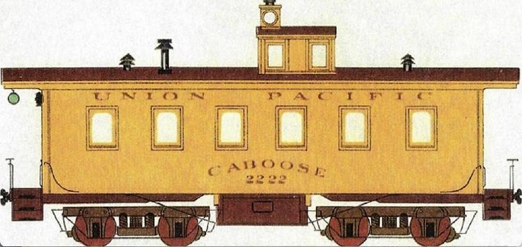
No font is going to 100% accurately replicate the hand lettering but here's info based on the latest research that should help. We know from photos that new color and lettering changed over the 6 year period during which the waycars/cabooses were built--at first by the South Park, then by the UP.
"Waycar" versus "Caboose": this changed over time, in fact the UP called them both during this period. One CCRR car was lettered "Waycar" the other "Caboose." 
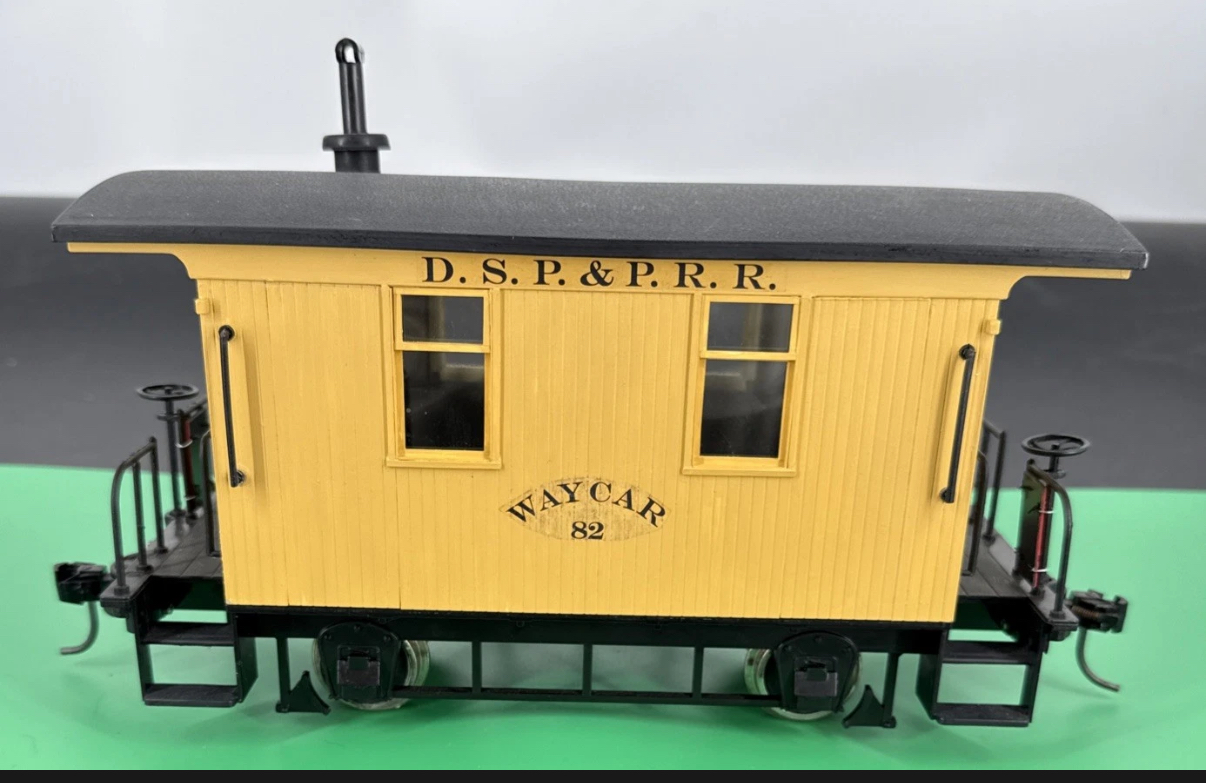
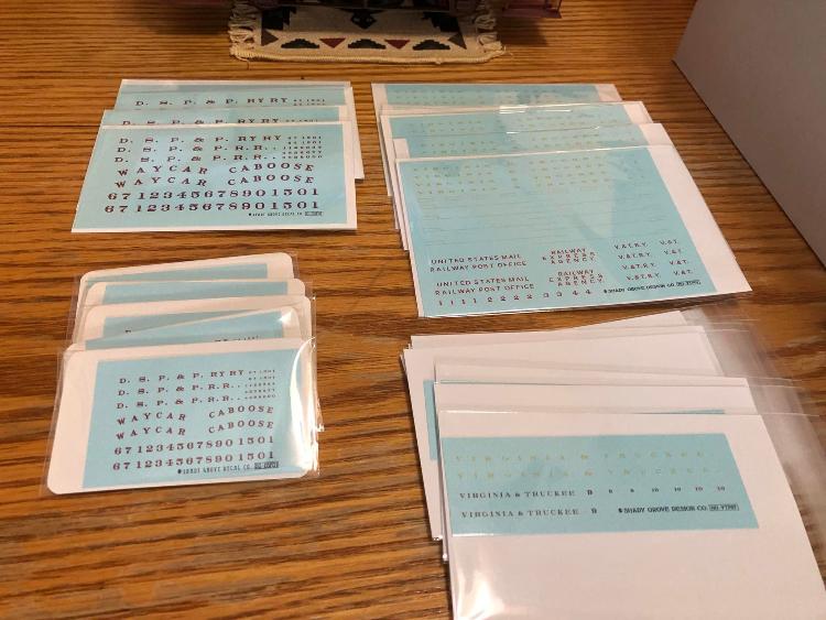
Shady Grove Decals had a set of decals that are based strongly on Andrew Bandon's research (he owns the company). His decals look like this: ![]() His research, probably the best we have at the moment (that has been widely shared) is in this diagram: ![]() 
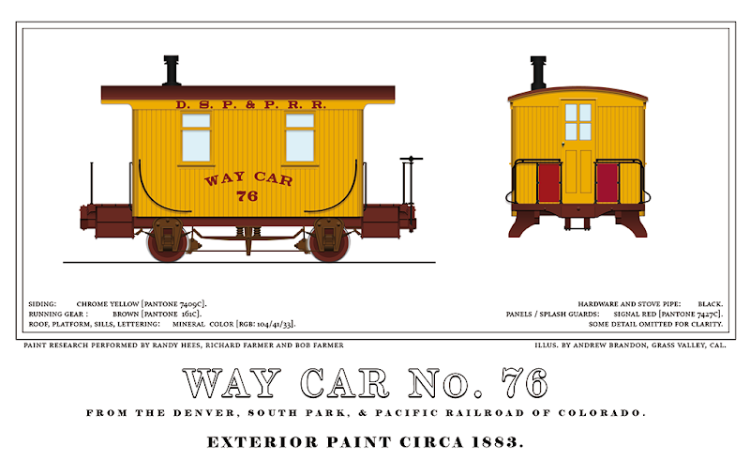
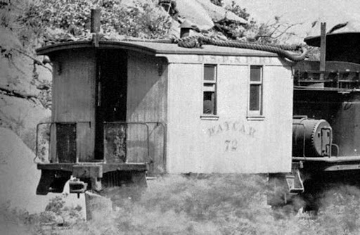
Note the lack of drop shade seen in the photo that was shared. Andrew's diagrams are based on photos and UP documents of the period for both color and lettering. Not all photos conclusively show drop shadow--the earlier (#60 to maybe #70/71) were red with white lettering without drop shadow; the later (maybe #72-#80 and the two Colorado Central cars) per the latest research were yellow with red lettering. We have at least one ca 1887 photo in Chalk Creek showing two of these cars, one red, one yellow. My conclusion is the cars were not repainted unless extremely damaged and repairable, even at this early period. I don't know if Andrew's still selling these decals or not, his website https://www.western-spirit.org/shady-grove/ seems to not have the list but he has an occasional presence on Facebook, so a search for him there and message may work to find out. Otherwise, get back to me and I can reach out to him. 
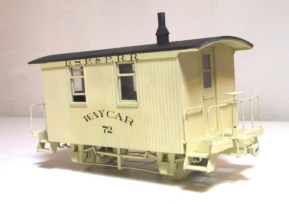
The other decal vendor is Great Basin, 
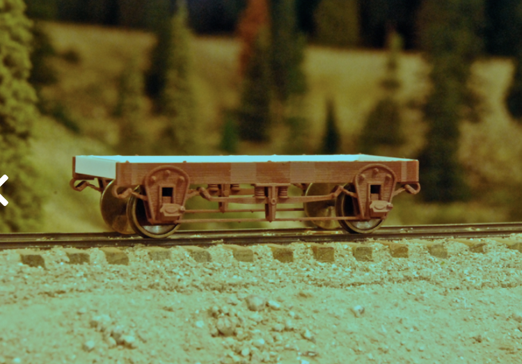
https://3dptrain.com/products/gbc-c006-utah-northern-narrow-gauge-cabooses-decal-set-hon3-sn3-on3. Josh Barnhill, the owner/artist, only creates decals he can accurately research from images. He is fastidious about accuracy and so his lettering is typically generated and cleaned from clear broadside images. While he doesn't have a South Park set (he does have several C&S variants) he is a Utah modeler, is a fantastic researcher and works closely with Andrew Bandon and Randy Hees on the UP colors of the 1880s. He has a set for the U&N cabooses of the same era, cars that may have come from the DSP&P during the 1883-1886 period. Here is an image of his HOn3 model which is further info for you on lettering: ![]() 
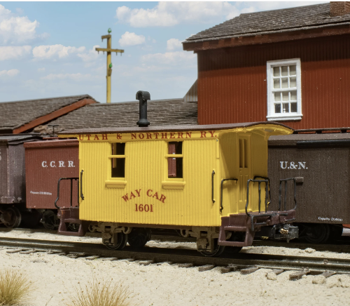
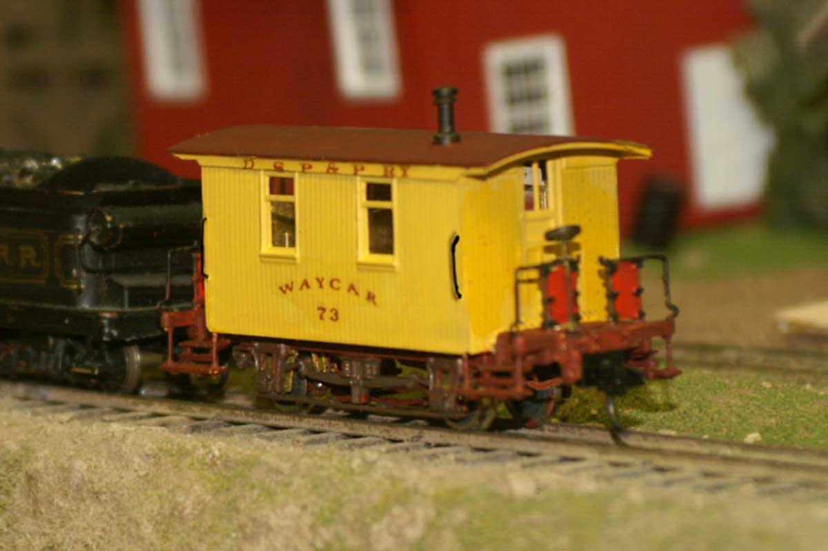
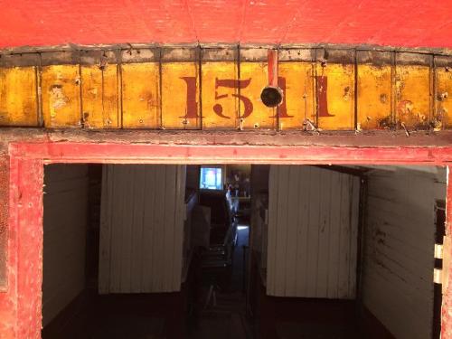
Finally, color from the post-1885 renumbering has survived on at least one waycar (under a roof end overhang), discovered during restoration. The yellow and red, and the lettering, suffered some weathering discoloration but are original 1885-1887 and may help inform your project. Josh's colors on his U&N car is probably very accurate for an as-new car.
Dave Eggleston
Seattle, WA |
|
Wow Dave, great information.
Thanks!
Norm in Littleton, CO
- on the C&S Silica Branch |
|
Yes, this is far more info than I ever expected. Thanks so much!!
|
|
This post was updated on .
But wait, there's more.
This is the actual, real time 1887 UP standard color sample discovered by Randy Hees and Andrew Bandon. Josh's model and decals follow this primary source. IIRC it was found in a paint company booklet (Sherman Williams?). This is the system-wide standard very likely used on the South Park and Colorado Central cabooses/waycars built from 1882-1884--which would be numbers starting roughly 71/72 to 80 + the two Colorado Central cars. Cars built earlier (1878-1880 were red) and likely stayed red at least to 1889 (but possibly keeping the color during DL&G days), theoretically only being fully repainted to the yellow if really badly damaged. ![]() While not exact for individual actual colors (print techniques, age and reproduction for the web cause things to vary), it is the standard I would recommend following for accuracy. Look at Josh's model for the yellow which is brighter than this print image, and there are arguments to be made that in real life the color was. Or maybe not. Just sayin'. So...lettering should be more spaced, less compact. Note also underframe and platform and truck colors. And as has been discussed elsewhere in this forum, the "splash panels" seen on the end railings of some cars (#72, the two CCRR cars) were likely a bright red color. And there should be two of these on each end. If you really feel like it, and given your model's large scale, you might also want to consider adapting the underframe to the rocker suspension the South Park cars rode on, very common at that timeframe on railroads. Here is how George Sebastian Coleman interpreted it and to my eye his 3D print is lovely. ![]() The suspension design is nicely laid out in this image of a PRR caboose from the 1879 Car Builder's Dictionary: ![]()
Dave Eggleston
Seattle, WA |
|
A very interesting thread.
In the B&W photo, I believe my eyes see a drop shadow, a red drop shadow, which does not appear in the UP standard above. Whether the lettering is brown or black with a red drop shadow is the debate. Rule No. 1 may have to prevail. I believe that Leadville Shops is on the cusp of releasing the 2-axle Waycar in kit form within the next six weeks. Decals may be available separately, if you ask Bill nicely. I am sure the kit will be released in Sn3, but may also be available in HOn3 and On3. If you want a really accurate Gn3 model, it is worth asking.
Keith Hayes
Leadville in Sn3 |
|
This post was updated on .
Keith, I agree on modeler's license. The evidence offers room to wander off the path and remain plausible. If I may, here are some more thoughts on this.
#72 was possibly built in 1881, and may be the first UP-built South Park waycar, with decoration perhaps reflecting the lingering optimism (and sometime madness) of the UP's expansion. The many photos of #72, on Jackson's special pulled by renumbered Mason #42, are reported as being 1886, a year after the UP renumbering. It is interesting to see #72 not renumbered 1510, reflecting a drag in the paint shop's relettering and another fantastic wrinkle for the modeler: you can have red and yellow waycars with lingering South Park numbering or new UP numbering if you chose the 1885-1887-ish era! Andrew's drawing of #76 is a car built around September 1883, possibly the 5th UP-built waycar, built as the South Park's fortunes began to stagger. I believe he opted to leave off the drop lettering for a couple reasons. One is his consideration of the 1887 standard as a guide (which does look like UP cars lettered similarly in older photos) as well as his choice to reflect what he could validly support, avoiding "maybe" on certain details. He may also be considering a known simplification in decoration that was already underway in the US. In the process he doesn't add the drop lettering--and may be right. Or wrong. We also know the two CCRR waycars 27/28 were built in Omaha within months of #76, around October and December 1883. 1884/85 photos of these show one lettered "waycar" and the other "caboose" despite an age difference of 2 months, suggesting lettering was not static in this period, even in Omaha. Damn humans. Sadly the photos are fuzzy and may or may not suggest drop shadow. I'd also add in the thought that drop-lettered decoration on a lowly waycar may have become seen as over-the-top, leading to backing off the idea at some point. The UP made a lot of bad big decisions but was also a nit-picking operation on small details. I hit the same wall you suggest on lettering color. That's a whole other can of worms mixed in with the painter's drop lettering coloring aesthetic. You suggest black or brown lettering and I am skeptical of black, I lean more to brown, reddish/brown or even brighter red. As to the drop shadow, if it is there, the color could be something quite unexpected because the emulsion doesn't give the answer other than suggesting a value warped by its blindness to certain color wavelengths. We could be seeing some blue, a green, an ochre, an orange, a violet...but what exactly? We have no accurate idea. If red it would be a very light variant, like a pink. Color aesthetics in the early 1880s can be quite at odds with what we've come to expect. The Baldwin style guide in Stanford's collections is just one place to sample the wild array and decisions: https://searchworks.stanford.edu/view/fb584yc9195
Dave Eggleston
Seattle, WA |
| Free forum by Nabble | Edit this page |
