I discussed this with my friend John Coker in 1980 as I was finishing up my first On3 locomotive project, #74.
It appears that the lettering on the prototype C&S narrow gauge locomotives was actually aluminum or aluminum leaf, but the tricky thing about it is how it actually looks under indoor layout conditions compared to how aluminum looks to the eye, or the camera, in natural daylight. Or so our conversation went. I was willing to go either way, but I knew this would be a pretty significant decision as I planned to try even then to depict C&S Mainline operations with multiple engine trains. Which would require several locomotives at a minimum. So there would be no turning back.
In the end, we decided that using white lettering would look more "natural" under layout conditions, and I have never looked back. All of my C&S engines, including ones I have parted way with over the years were finished with white lettering, with the sole exception being #7, which has gold lettering.
I have friends who have used aluminum lettering, and with a little weathering or soot, they are indistinguishable from each other. If anything, as Coker pointed out at the time, white lettering stands out brighter under light weathering.
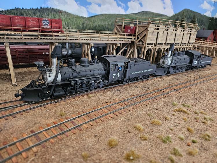
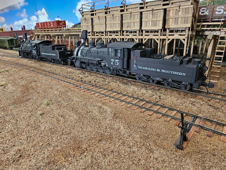
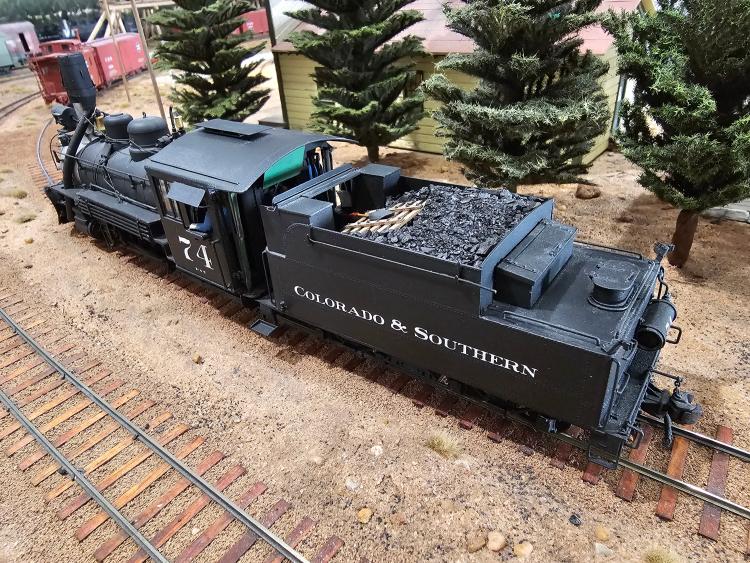
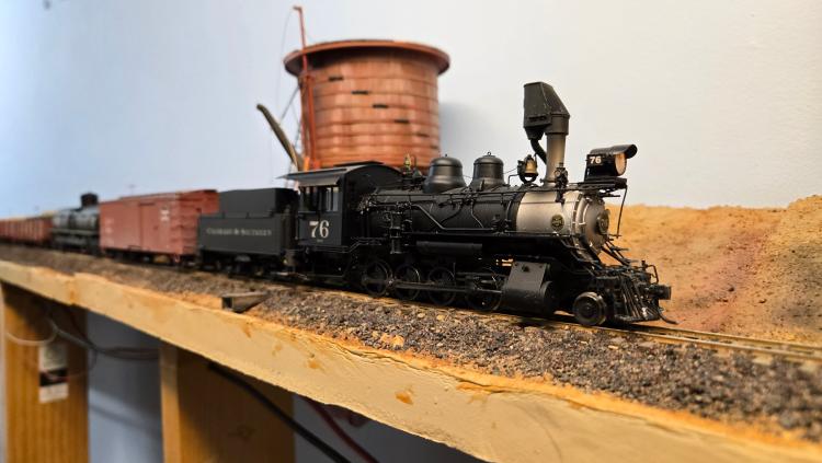
Here are a couple pictures taken here, with white lettering.
Whichever way you go, it will be the right answer. Rule #1 is that it's your railroad!