The Temple of Fashion in Central City, Colorado
|
Hello! Does anyone have any color pictures of the TOF? We've found plenty of b&w pictures, but nothing in color.
Thanks! |
|
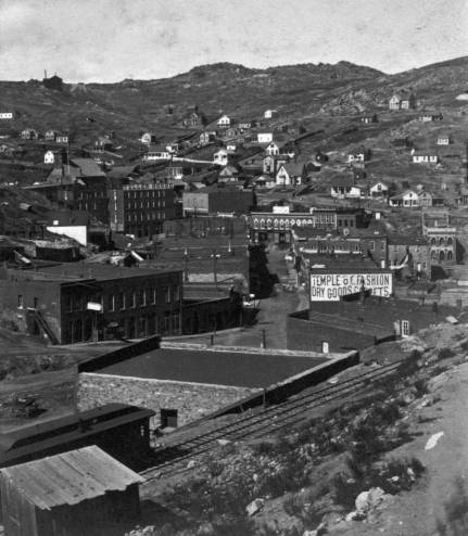
Here is one of our old black and whites of the Temple of Fashion.
|
Re: The Temple of Fashion in Central City, Colorado
|
Administrator
|
This post was updated on .
Thanks for posting this picture. I was completely buffaloed by your question. This has to be a pretty early photograph, easily decades before the availability of color film. Do you have any information on what years this place was in business? I'll ask Joe Crea if he has any idea how we may be able to glean any information on the color from the photo.
There is a short duckbilled coach or combine on the rails, no vehicles anywhere in sight, and the sign is clearly aimed at the station. Its purpose is clearly intended to attract attention. My guess is that the building wall is painted white, and probably lettered in red paint. Nonetheless, its presence has eluded me all these years in photos. But this stuff is a bit out of any primary interest I've had in Central City in the past. Chris? What do you make of this? When were duckbilled cars retired? |
Re: The Temple of Fashion in Central City, Colorado
|
The ToF signage was long changed before the C&S built the new Brick Depot at Central.
The OP's image provided(Duckbill) above is the X-11619, from the DPL. There are more threads on Central available via the SEARCH box. See Dave Eggleston's excellent take on that scene http://c-sng-discussion-forum.254.s1.nabble.com/Central-City-photo-chronology-exercise-tp10258.html Note: those DPL links are history; to view you will have to open the DPL site and import the call numbers yourself. I have seen a hand-coloured rendition of the ToF but that would have been artistic license by the colouriser. The background could have been White, or even Straw-Yellow. From my Collection. 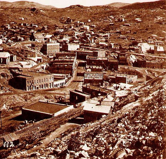 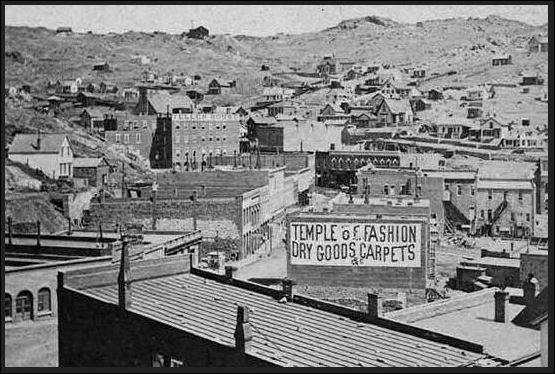 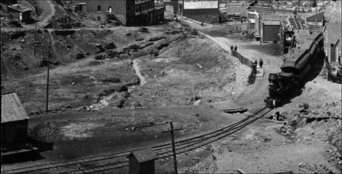 This shot is from Dan Abbott/Dell McCoy's Gilpin Railroad Era by Sundance pg339, a portion of a Harry Lake photo. 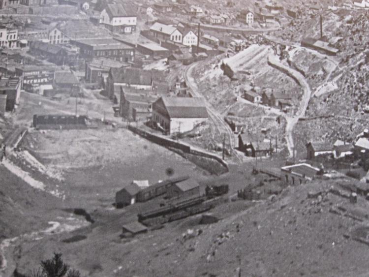
UpSideDownC
in New Zealand |
Re: The Temple of Fashion in Central City, Colorado
|
Administrator
|
Thanks, Chris. And thanks to Romo too, for bringing this to our collective attention. As well as to Dave and others who posted in the referenced link!
|
Re: The Temple of Fashion in Central City, Colorado
|
Yes Mike, thanks to Dave for his work, which I hope gets more attention in his thread.
Some more wet day research... X-11620 Lachlan McLean photo at the Denver Public Library. 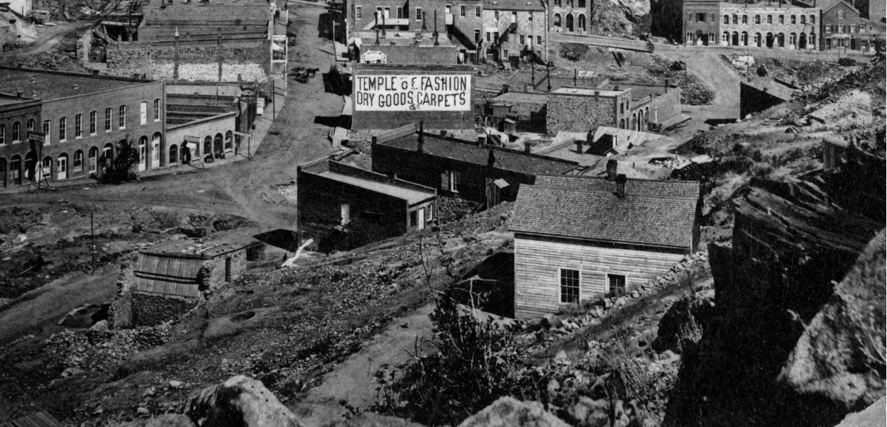 WHJ-10143 at the Denver Public Library. 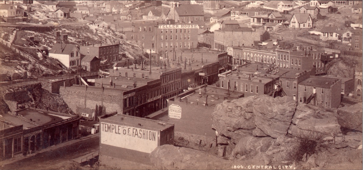 This may give some interpretation to the painting out of lettering and colour bleeding through DPL Z-12100 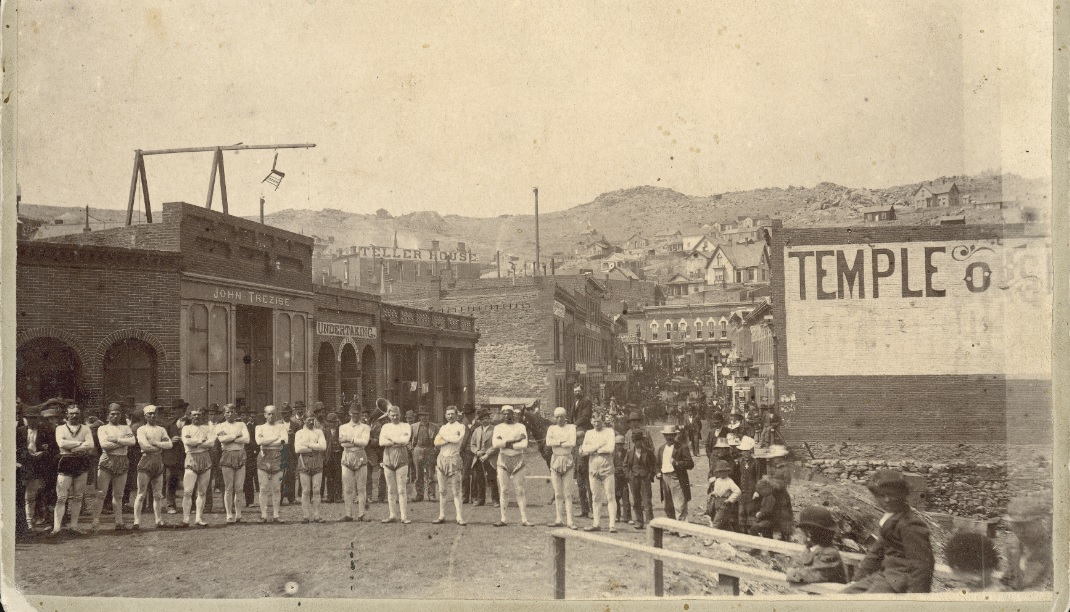 Lots of references to that business in the RM News Jan 1877 post CC fire. 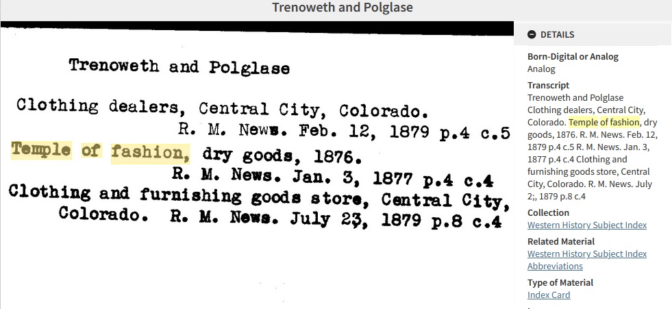
UpSideDownC
in New Zealand |
Re: The Temple of Fashion in Central City, Colorado
|
Administrator
|
Chris, what can possibly be going on in that last photo?
Are those guys training for the Olympics? Or just showing off in their spiffy uniforms? Have they lost a bet? And, why is there a chair hanging from that makeshifts gallows on the roof across the street? No wonder they lost their status as the State Capitol. They were clearly 130 years ahead of their time. |
Re: The Temple of Fashion in Central City, Colorado
|
No Idea Mike,
....maybe something to do with rarified air.... 
UpSideDownC
in New Zealand |
Re: The Temple of Fashion in Central City, Colorado
|
In reply to this post by Mike Trent
A group of fire fighters?
Keith Hayes
Leadville in Sn3 |
Re: The Temple of Fashion in Central City, Colorado
|
Or dancers on the TofF ballet squad.
Dave Eggleston
Seattle, WA |
Re: The Temple of Fashion in Central City, Colorado
|
In reply to this post by ROMO
This is an interesting question. To do this sign plausibly will mean getting educated on period practice in 1870s Colorado and not trusting what you think you see in the photos.
We know only one color on this wall with some chance of accuracy: the unpainted brick. Unless the original billboard is sitting under whatever is on that wall today--and that seems unlikely (?)--we will NEVER know what the sign colors were because we have no idea what emulsion was used on the tiny number of photos of the TofF taken in the mid-1870s. Different emulsions are blind to different colors. Start by reading up on emulsions (start here: https://www.pacificng.com/template.php?page=/ref/color/index.php) and then keep hunting. Jim Wilke broke a lot of mythology decades ago, Randy Hees and Andrew Bandon are doing the same recently and there is a ton of conversation amongst some young historians who are actively collecting period paint chip books and shattering perceptions. The backing could be white but it could be yellow (think of the recent waycar paint discoveries), light green (think of the recent Tiffany reefer discoveries) or even light blue (think of all those white skies seen in glass plate photos). Heck, I've seen images of the GSL&P Sunset station and realized it was 2-tone in the late '80s but the emulsion's blindness almost hides this. As to the dark lettering, I'd lean to a red, deep brown, burnt ochre...or black. But then maybe a deep purple or green? And then there's weathering, the light that day...gah, a lot of things mess things up. And those bloody Victorians had color sensibility unlike ours. Lots of traps. Seek out examples of mid-1870s Colorado signs in collections, signs that haven't been touched, ever. There are period books written by sign painters on sign painting. Check out google books. Possibly oil paintings of streets painted in this area at that time. Yes, it's finding a needle in a mound of hay. If you're to do it right, it'll take a lot of effort and cross-checking. The fact is, if you had a color photo from the 1870s I'd still question the actual colors--not the hue (red, blue, yellow, etc) but the specifics of color (is it saturated/desaturated, weathered, warm/cool). However you paint it most people won't have a clue on your color choices but those in the know will. And we'd all argue that if you can't truly hit the actual colors it was, at least stick as close as possible to solid research on sign painting for that time and place.
Dave Eggleston
Seattle, WA |
Re: The Temple of Fashion in Central City, Colorado
|
Administrator
|
Thanks, Dave, that's good reading.
|
Re: The Temple of Fashion in Central City, Colorado
|
This post was updated on .
No problem! The color translation from B&W photo question is a fundamental problem. Even for those modeling in the 30s I'd question the value of using color images to claim a color choice other than to understand how much variation existed across red cars on a high altitude broke railroad.
I'm reading a book on weathering by Tim Shakleton, an English modeler and master of weathering, who quite wisely states that what we see in current restored engines (think Dan Markoff's Eureka) does not reflect the reality of objects used daily in the open--these restored relics are kept too clean. I'd argue the same for that billboard, it weathered at high altitude quite quickly and wasn't kept pristine. BTW, that first photo is very, very early. Note that the Hawley building is not in it's expanded form, which if I remember, came in about 1880, adding a warehouse section to the left. Note the hay bale slide to the door in that picture. Hawley's both sold hay and had a stable in the bottom level. And after that business was expanded there was a door where that slide is and the roof remained flat for quite some years before getting the peaked roof we see now. I just wish the photographers--even just one--had turned his camera to the left and gotten a panorama showing us the yards. It would answer a ton of questions and allow early-year nut cases such as myself able to confirm the layout.
Dave Eggleston
Seattle, WA |
Re: The Temple of Fashion in Central City, Colorado
|
One more for the road; ahem, I mean Street.
 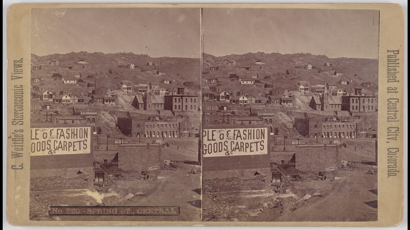
UpSideDownC
in New Zealand |
«
Return to C&Sng Discussion Forum
|
1 view|%1 views
| Free forum by Nabble | Edit this page |

